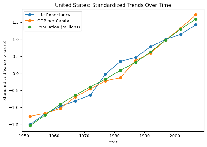
import pandas as pd
import matplotlib.pyplot as plt

df = pd.read_csv("gapminder.csv")
country_name = "United States"

c = df[df["country"] == country_name].sort_values("year")

# 标准化(z-score),避免尺度压缩
c_norm = (c[["life_expectancy", "gdp_per_capita", "population_millions"]] -
          c[["life_expectancy", "gdp_per_capita", "population_millions"]].mean()) / \
          c[["life_expectancy", "gdp_per_capita", "population_millions"]].std()

plt.figure()
plt.plot(c["year"], c_norm["life_expectancy"], marker="o", label="Life Expectancy")
plt.plot(c["year"], c_norm["gdp_per_capita"], marker="o", label="GDP per Capita")
plt.plot(c["year"], c_norm["population_millions"], marker="o", label="Population (millions)")
plt.xlabel("Year")
plt.ylabel("Standardized Value (z-score)")
plt.title(f"{country_name}: Standardized Trends Over Time")
plt.legend()
plt.tight_layout()
plt.show()